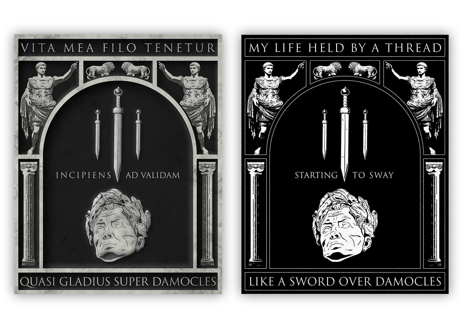
Like A Sword Over Damocles
In the fall of 2021, Trivium released their tenth studio album In The Court Of The Dragon. Although I loved the whole album, one of the songs that caught my eye the quickest was “Like A Sword Over Damocles”. I wanted to take my interest with this song and combine it with my love for band t-shirts, while also experimenting with some different effects and including some motion graphics practice.
First, I started by making a vector illustration depicting classical roman imagery complete with lions, caesar, gladii, marble pillars, and the a roman-style font. I arranged these in a frame that I could imagine seeing on a poster or the back of a t-shirt, but in the style of a marble wall carving. I used three levels of depth – bright gray, medium gray, and dark gray, which give the illusion of depth, along with shadow techniques i picked up with my experiments in neumorphism. Once I’d completed the marble version, I pulled together a rough translation of one of the song’s lines in Latin – that line being “My life held by a thread / starting to sway / like a sword over Damocles”.
With the primary illustration completed, I retooled it and made it all black and white, with an English translation, to reflect the ‘band t-shirt’ version i’d imagined. I thought the transition between the marble version with Latin to the black and white version with English would be interesting to see, so i prepared a simple motion graphic that had the different elements fall into place before transitioning to the black and white version, with the song playing in the background.
The layout of the illustration lends itself to a mobile format – in particular, i made the dimensions of these illustrations correspond to the maximum vertical aspect ratio for instagram posts and videos. In many of my design projects in the past year, the appearance of the finished product from a phone has been an incredibly high priority, due to how overwhelming prevalent they are in media consumption.

