JULIA. Alternate Album Cover & Poster
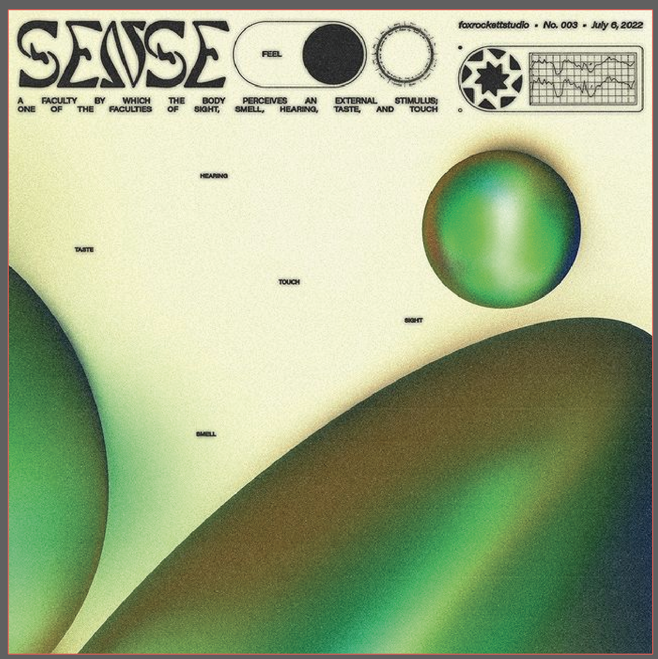
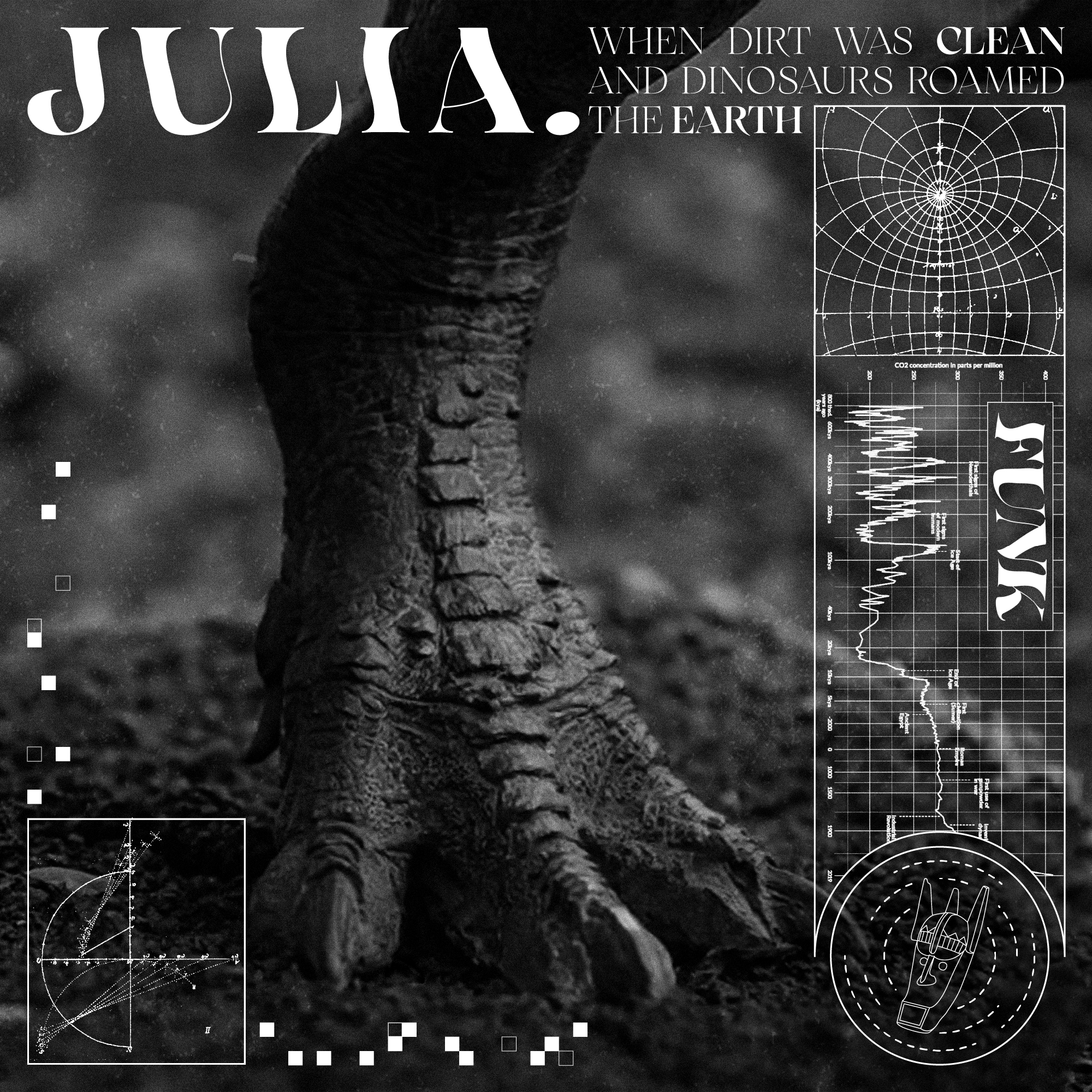
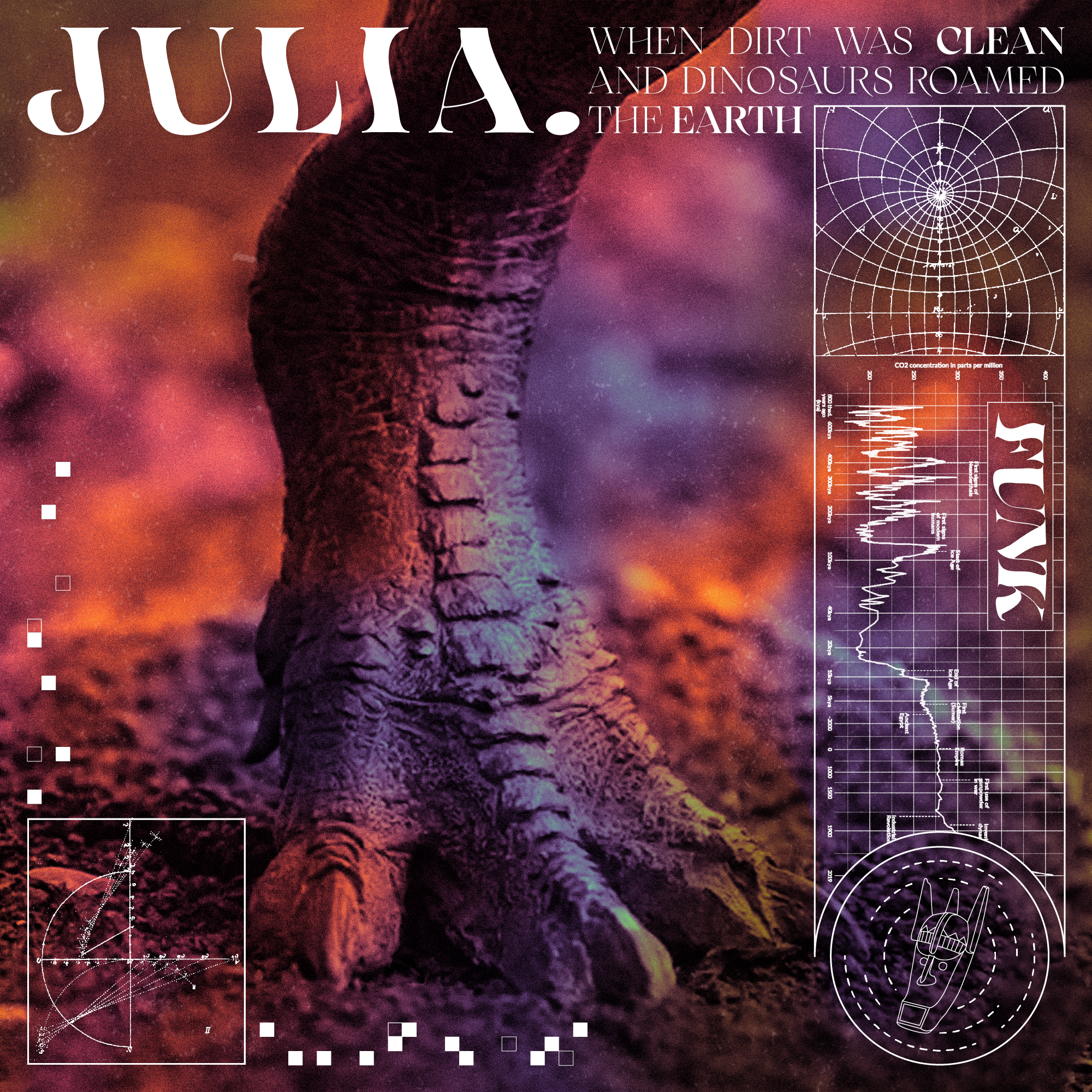
In July 2022, I’d been seeing lots of recent design trends in album covers, shirts, and posters that utilized a very particular style (Slide 1). Typically these would incorporate dense graphs and vague shapes/symbols which served to frame the illustration and fill in space while not being actual focal points. I decided I wanted to take a stab at this by designing an alternate version of the cover of their recent album When Dirt Was Clean and Dinosaurs Roamed the Earth.
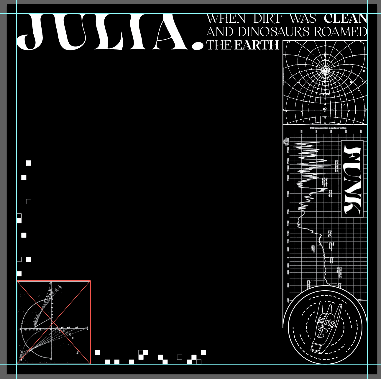
To start, I laid out some basic text with the band name and the album title. Then, I pulled a couple of graphs I found after some googling around and filtered out the backgrounds, and used them to frame up the right side and the bottom left corner of the artboard. Lastly, I pulled the mask symbol I drew for them in my previous project and added it to the bottom right corner as a sort of stamp or branding mark (Slide 2).
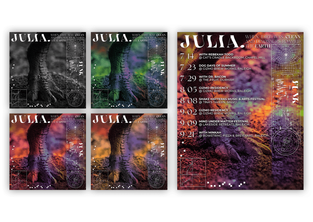
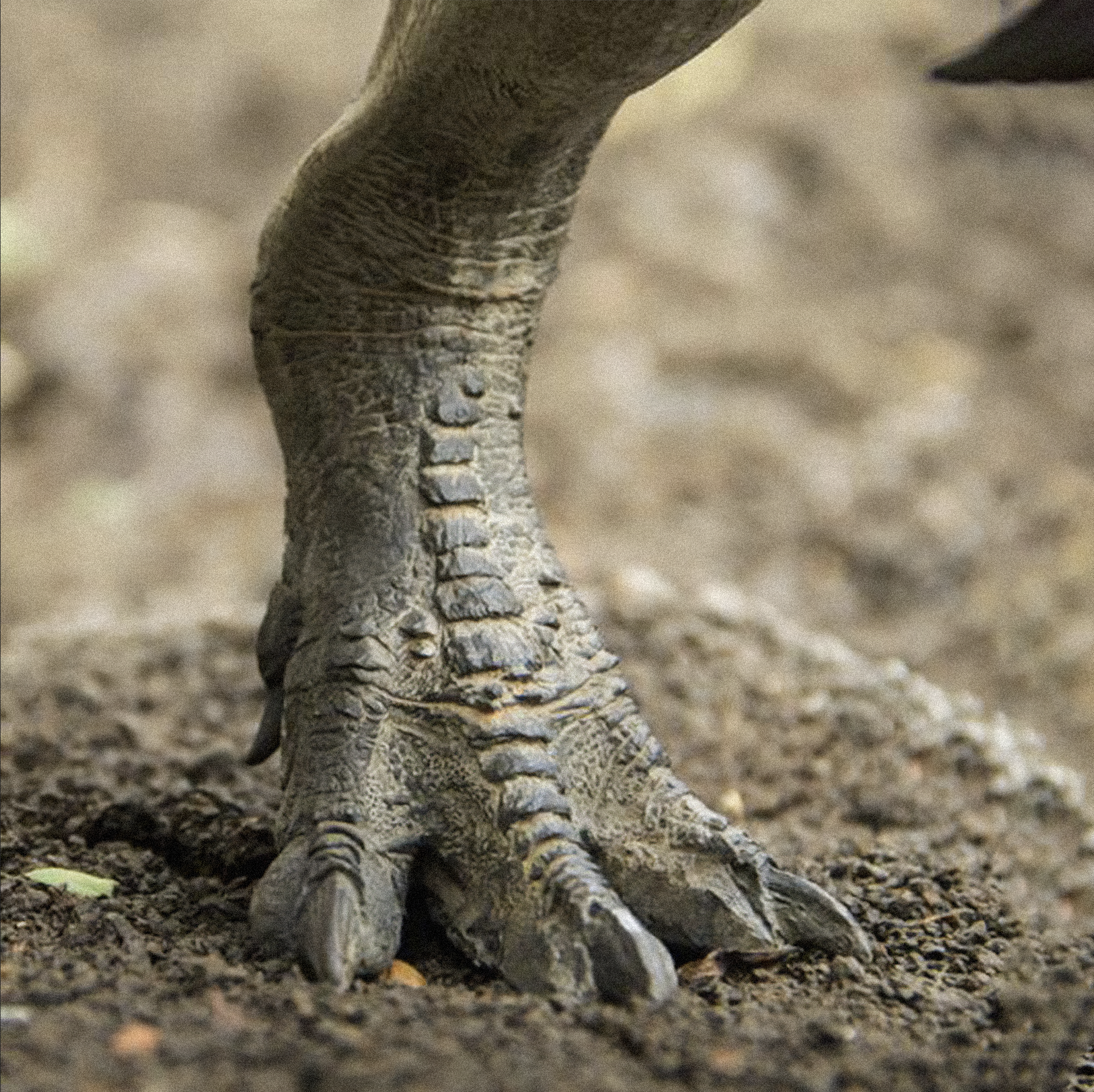
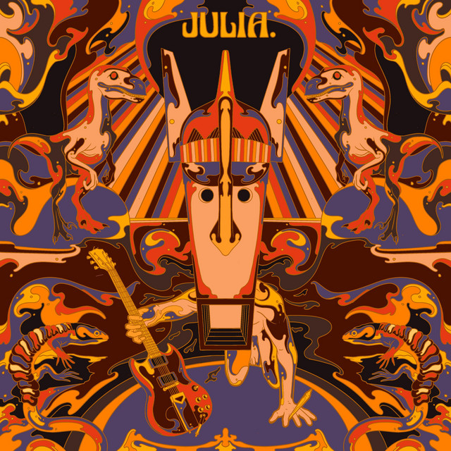
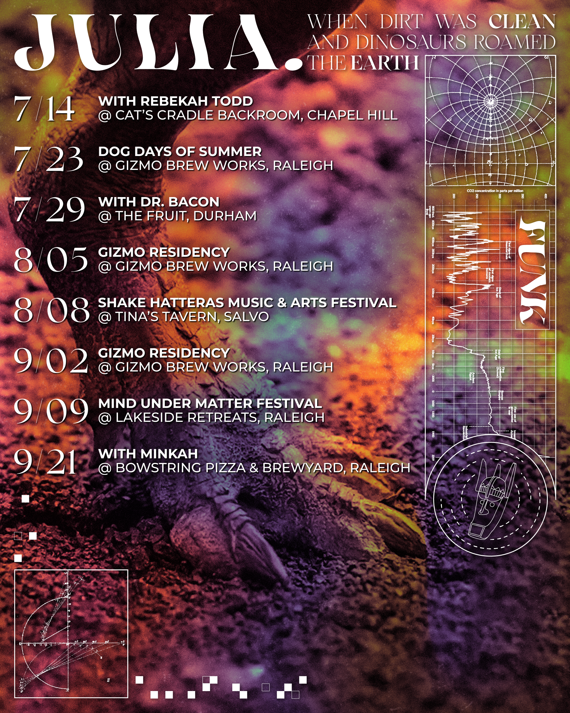
With the primary graphics work completed, all I needed was a picture to fill in the background (Slide 3) and a gradient to add some color. I looked up some pictures of dinosaur feet and fossils of footprints to fit in with the title, and found a few good ones – one that was a bit shorter which I used for the more square album cover (Slide 4), and a taller one for the poster version (Slide 4). For the gradient, I pulled all the colors from the original album cover (Slide 5) and adjusted the blending modes a bit to fit with the same general theme while still adding some variety – I ended up with 3 final color variations (Slides 6,7, & 8) based on knocking out different color channels, as well as the original black and white version.
