Crawlspace Consolidated
In Spring of 2023, I had a friend of a friend looking to start their own business as an independent crawlspace technician under the name Crawlspace Consolidated. In this case, the client’s primary focus was a quick turnaround and simple, straightforward branding – nothing too fancy, nothing too expensive.
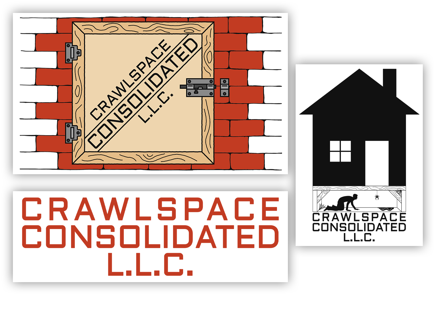
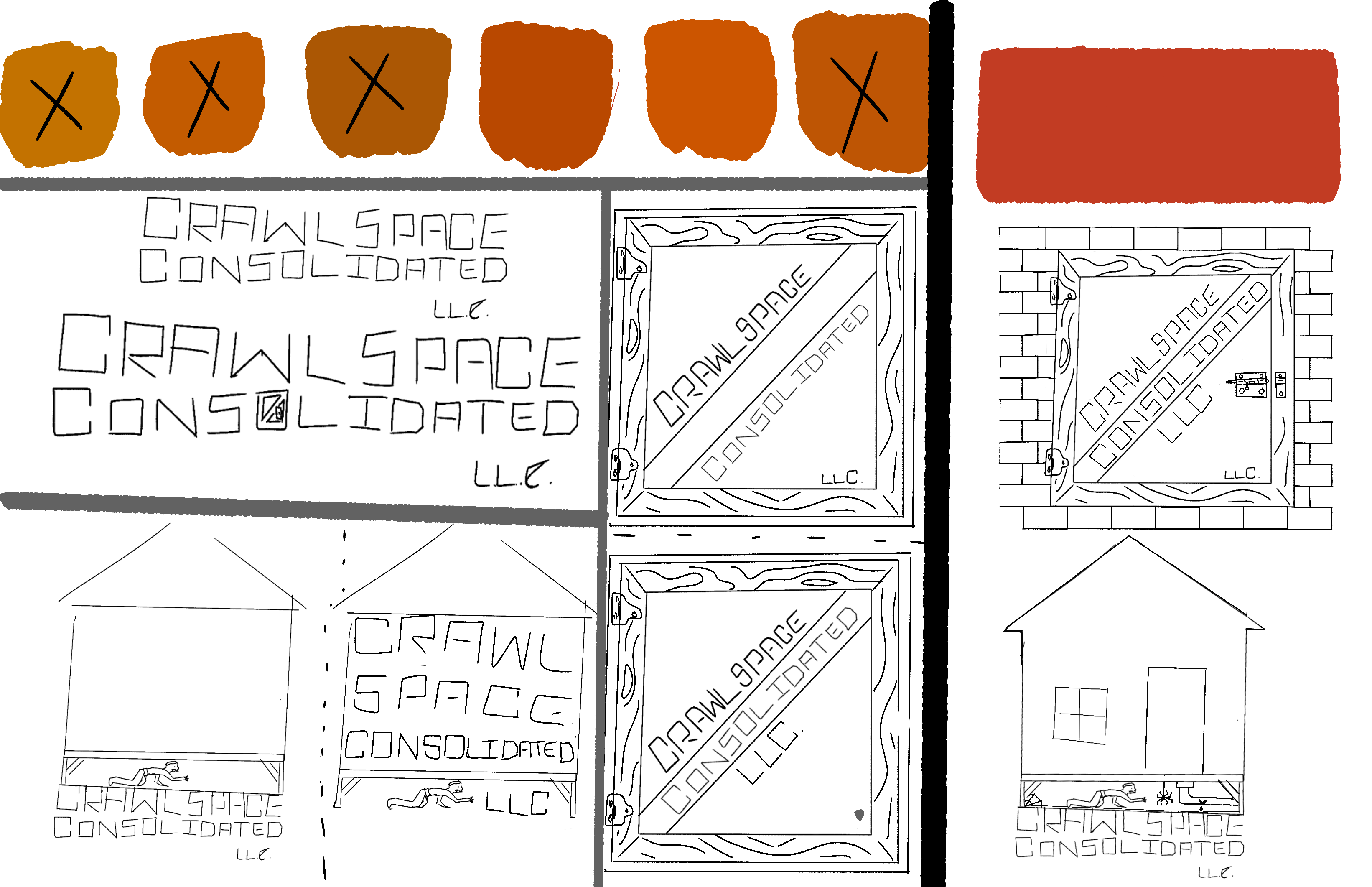
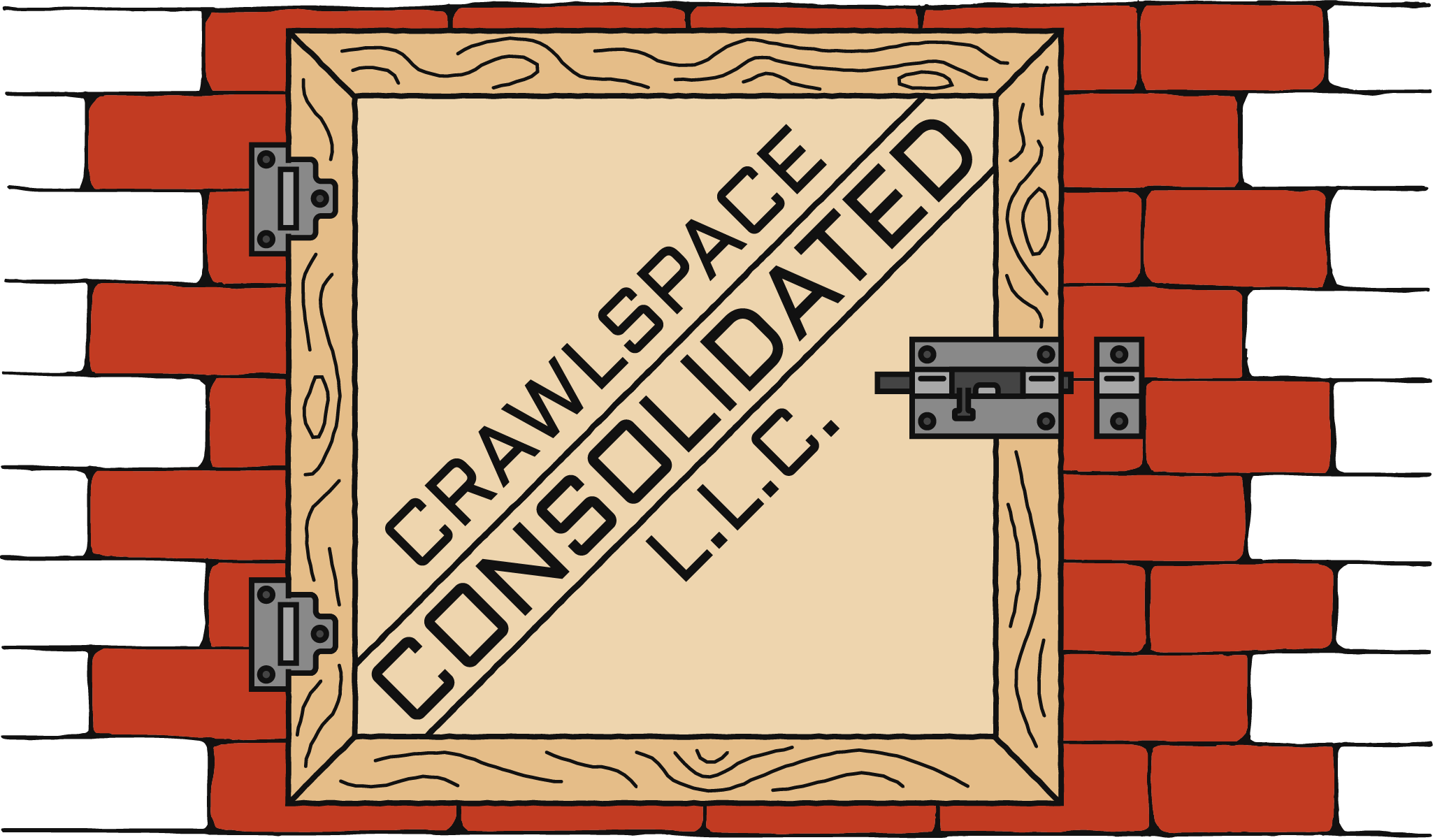
I started with a few logo concept sketches and color options (picture 1). For the logos, I decided to try drawing an actual crawlspace (pictures 2 and 3) for a larger variant that could be printed on the back of a shirt, and a simple crawlspace door (picture 4) for a smaller, simpler primary logo. For the colors, I started by choosing a few different orange tones, taking inspiration from brands like Home Depot as many clients already associate these colors with that market in large part due to the strength of Home Depot’s brand. This association would help to quickly convey the handyman / service angle of my client’s business.
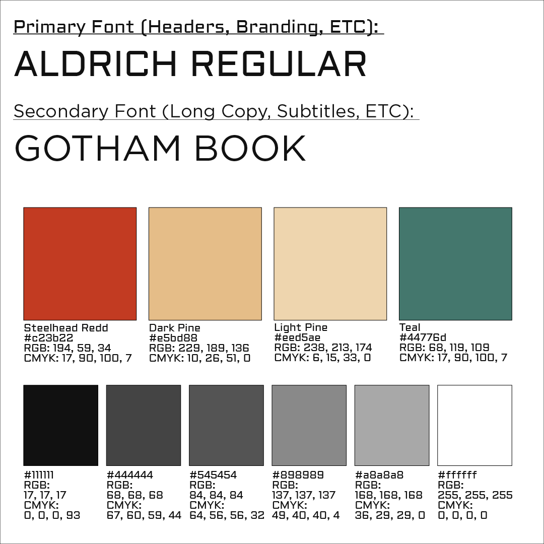
The client was very happy with all the initial sketches and wanted to push forward with the exact designs, forgoing a lot of the back-and-forth revisions common in the branding process. Because of this, I just had to digitally recreate my logo concepts in illustrator with a few revisions and changes. I finished by putting together a simple branding document (picture 5), showing the font choices in addition to color selections. I selected some nice wood tones to further emphasize the handyman-esque aesthetic, and a muted teal for some contrast in potential future designs.
