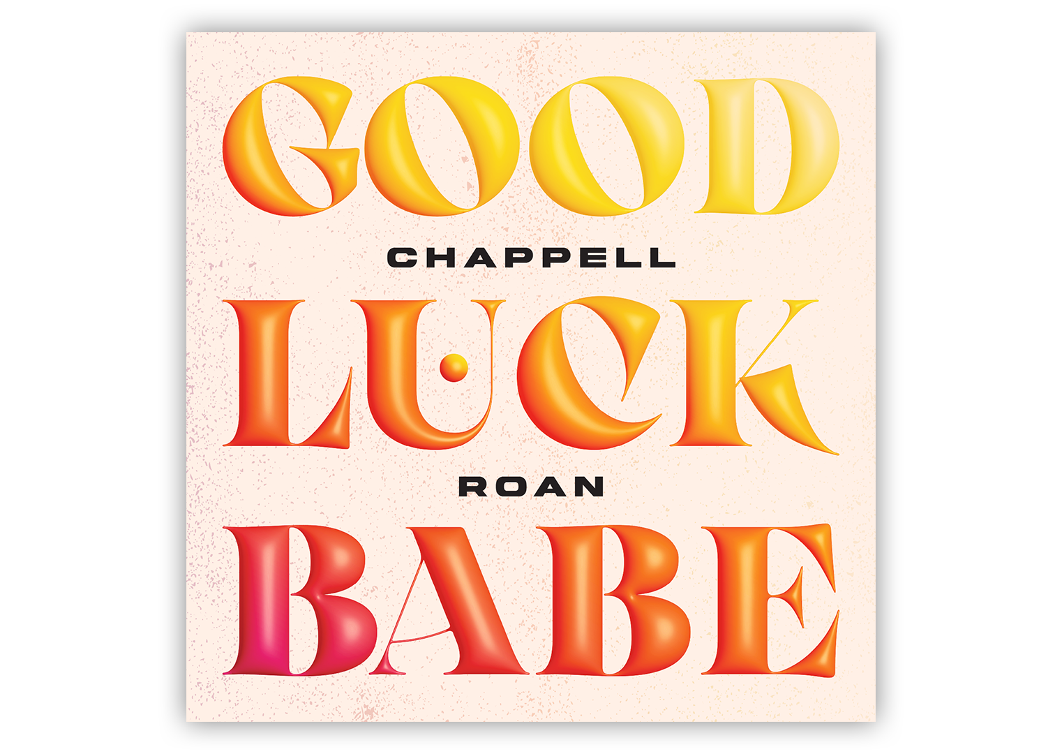
This mock single cover was a quick, fun project for the purposes of experimenting with Adobe Illustrator’s 3D tools and how they interacted with color and blending modes. At the time of making this, I’d been listening a lot to Chappell Roan’s “Good Luck, Babe!” and since the name was very symmetric in the sense that it was 3 words with 4 letters each, it seemed like a good candidate for a simple text design.
To begin, I made a simple off-white background with a faint grunge texture overlaid in the same colors that show up on the main letters. experimented with the different materials, lighting settings, and inflation settings in the 3D tool until I reached a satisfying look, maintaining some of the delicate lines of the typeface while still achieving a realistic, bubbly look.
At this stage, the letters were a plain white color. In order to get the consistent gradient across the whole composition (as opposed to just setting the fill for the object to the desired gradient which would result in each letter having a full gradient), I had to make a rectangle with the desired gradient fill and then clip and invert the letters overtop it. This created a sort of translucent effect, akin to what you’d see with the colors on a soap bubble floating in air. Although I thought this was interesting, I wanted something that felt a bit more substantial so it didn’t fade into the background at the top, so I tripled the layers, set them all to color burn, then un-inverted the middle layer to add some more weight back. I then layered all 3 of these over a non-inflated version of the text set to the same color as the background, so the letters would not take on any of the texture beneath them due to the blending modes in the other 3 layers.
From there, I picked a font and added in the artist’s name, then repeated the earlier process with the small bubble shape held within the U.

