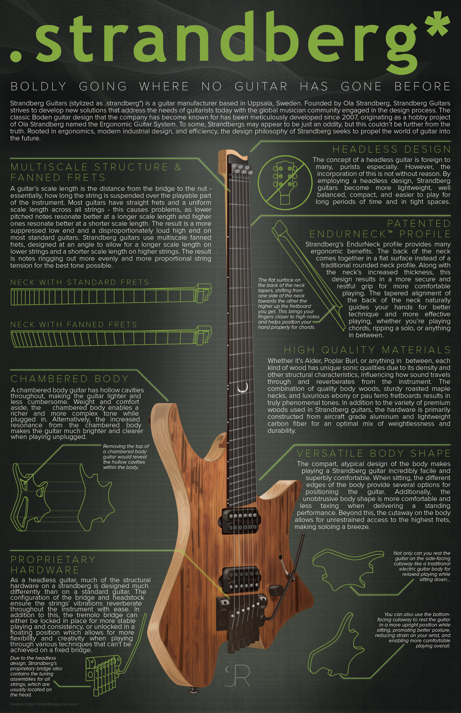
Behind The Infographic: .strandberg*
Boldly Going Where No Guitar Has Gone Before
About a month into quarantine, I began work on what would be the last final project of my college career. I'd been consistently focused on quality with my infographics, but I really wanted to step it up here and finish with a bang. The primary stipulation in the prompt was either use of a strong vector illustration or use of physical artforms like paint, photography, etc. I decided to go with a vector-based infographic, so nearly every part of the infographic aside from the background is vector illustration by hand.
Before I really get into the design process, I want to focus on the subject matter and why I chose it. I started playing guitar when I was 9 years old, with the quintessential starter guitar: a Fender Squire Stratocaster. Cherry red, white pickguard. It wasn't a great guitar, but it was an important first step. When I turned 14, I got a Schecter Hellraiser C-1 - a more artful design with a dark red flamed maple top and beautifully pearlescent abalone binding and inlays.
Even though guitar is all about creating sonic art, the visual artistry is an important part of the experience to me. A guitar could be of the highest quality and sound nice, but unless it looked the part I wouldn't be there for it. This new guitar represented a new point in my time as a guitarist where I was taking it seriously as an art form and more than just a hobby. A few years later, before my high school graduation, I bought an all-black Matt Heafy Custom 7-string Epiphone, mostly to play metal and dive more into my interest in heavier music.
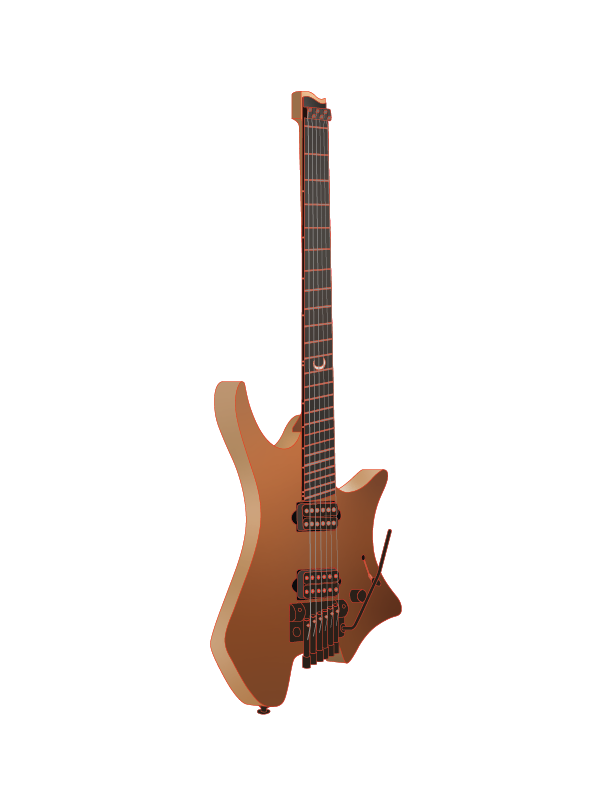
In college I got into progressive rock and metal. Bands like The Contortionist, Polyphia, and in particularly an Australian solo guitarist named Plini. With a one-of-a-kind approach to music and elements of Jazz, Metal, and everything in between he quickly became my favorite. It wasn't just the music though, it was also his alien but classy custom .strandberg* guitar, depicted in the infographic to the right.
With time, I became more interested in the headless guitar design. After talking with an experienced bassist who owned a Kiesel headless bass, I did some more research to learn what made a .strandberg* special. Benefits including better posture, easier playing, and increased comfort pulled me down the rabbit hole. The modern design combines aesthetics and comfort in a truly special way. Although I still don't have one of my own yet, I decided to take a moment and use this inspiration for something constructive, demonstrating what qualities make .strandberg* guitars so distinctive with this infographic.
The Process
The meat of the work came down to creating the guitar. Although it took a while to assemble the copy, the background, and the wireframe illustrations, that paled in comparison to the effort the main illustration took.
First, I had to create the outlines. I traced the general shapes from an image of the guitar and separated them into different layers for the body, the neck, the hardware, and several other parts to keep things from getting too cluttered. After this, I began the task of the basic coloring of each part. Some were straightforward with just one shade, other larger shapes like the top of the guitar required the use of Adobe Illustrator's freeform gradient tool.
Once all the basic coloring was complete, I began the process of adding texture, detail, and shading. The hardest part was definitely developing a convincing wood grain texture, but after several layers of detail such as soft blurry patches of color and thin lines emulating the flow of the grain, I was able to achieve a more convincing look before adding all the text, icons, and other details.