GROCEREASY
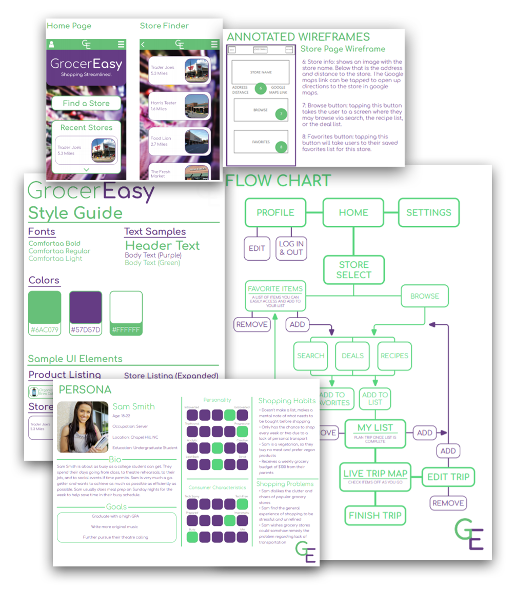
GrocerEasy was one of the major projects for a UI/UX Design class I took in my junior year at UNC-Chapel Hill. The point of the project was to design an app that help make the grocery shopping process more efficient or enjoyable, and to create a full package of materials to pitch the app including an overview, asset list, structural flowchart, target audeince persona, user journey chart, annotated wireframes, style guide, a designed mockup of the app, and an Adobe XD Interactive Demo.
“GrocerEasy is designed to be the all-purpose grocery companion of the modern age. As smartphones and other handheld technology have become ubiquitous, it made sense to me that we should no longer rely on plain notes and lists to guide our shopping experience when we can use our phones to aid us as they do in most other environments. To achieve this goal, the app was designed to work with any grocery store, maximize the efficiency of the average shopping trip by compiling all items in a user’s grocery list and plotting the quickest route through the store, and provide unique opportunities to its users in the form of deals and special store recipes. Through these functions and more, the app ultimately streamlines the entire grocery shopping experience, re quiring less consideration and effort on the user’s part in addition to incentivizing users to try new things they might not have considered before – all at the tips of our fingers.”
To download the full PDF including all aforementioned materials, click the button below.

