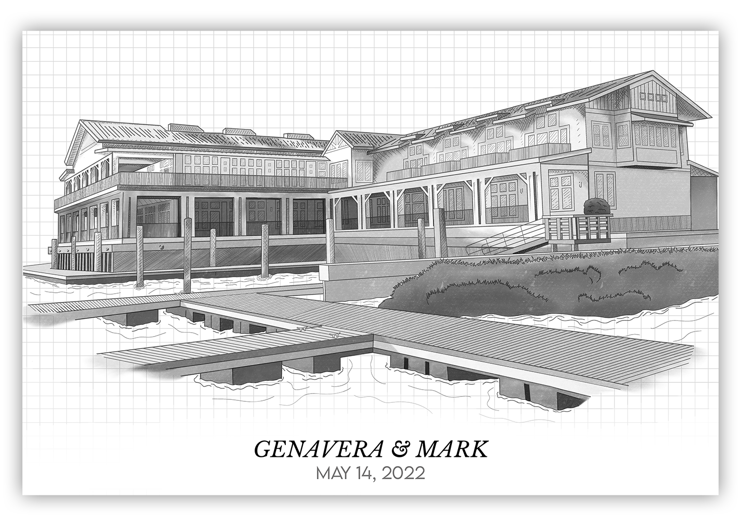
Genavera & Mark Wedding Illustration
For this project, my brother and his fiance wanted an illustration of the hotel they’d be having their wedding at to put in a matted frame for the actual ceremony, where wedding guests could sign their names in lieu of a traditional registry.
The general look they were inspired by was almost a bit like a technical drawing or blueprint – very clean and to the point, no extra frills. I wanted to combine the clean, straight lines of a blueprint with a more hand-drawn feel, keeping things simple but adding a bit of character. I started by doing the general outlines of the building and its floors, then followed up with details like windows, doors, and railings, before applying some shading and texture to finish it up.

